Post-Hoc Power:
Examining Zad Chow's Critique
Enthusiasm Curbed, February 20, 2019
Does Post-Hoc Power Corrupt?
Yesterday, I came across this very nice post by Zad Chow on Twitter regarding statistical power. Apparently, the post was inspired by a long discussion on the DataMethods Discourse discussion board. I highly recommend Zad Chow's aforementioned post and older blog post for the relevant background. Basically, the issue involves several statisticians telling several surgeons that calculating the "observed power" from the observed study data is a bad idea. The surgeons do not agree. Some jokes about the ultracrepidarianism of surgeons ensue.
Let me be clear: I have no specific stake in this fight. I am not a statistician, nor a surgeon. Though I guess all of us who may require surgery one day have quite a big stake in this issue...a discussion for another time. My main interest were the simulations in Zad Chow's newest post, which are presented below:
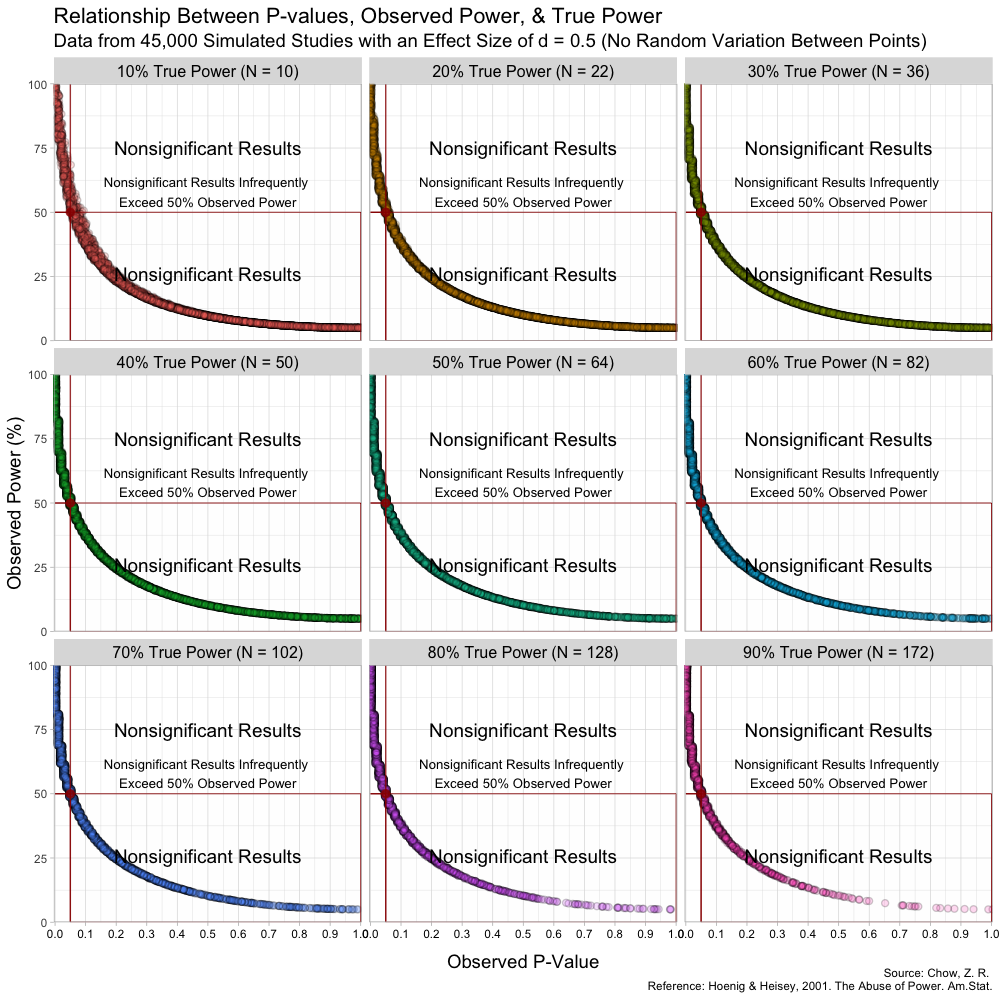
Taken from https://lesslikely.com/statistics/observed-power-magic/
The figure is quite nice, and includes a lot of information. Borrowing Chow's description directly from the post:
As can be seen in the figure, the rough shapes of the curves for different N (and thus true power) are basically all the same. The main difference is the changing density of points; as N increases, the observed p-values cluster closer to 0. I found this a bit hard to see on the original plots. From the figure, it is also a bit hard to know if the observed power values say anything about the true power value. Apparently, at least one other person was interested in this, so I replicated the results and added marginal distributions. The changing marginal distributions are shown in the GIF below:Here, I simulate 45,000 studies from a normal distribution and where I have set a true between-group difference of d = 0.5.
Group A has a mean of 25 and standard deviation of 10, and group B has a mean of 20 and also a standard deviation of 10. Thus, (25-20)/10 gives us a standardized effect size of 0.5. This is the true effect size, something we would rarely know in the real world (the true effect size is unknown, we can only attempt to estimate it).
In this simulation, the studies can be categorized by nine different sample sizes, meaning they have varying true power (something we know because it’s a simulation). True power ranges all the way from 10% to 90% and each of the nine scenarios has samples simulated from a normal distribution.
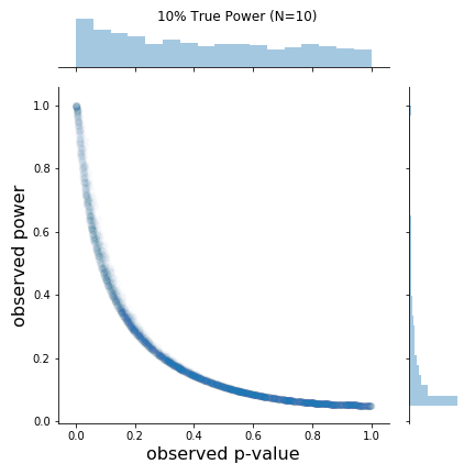
The changing marginal distributions for both the observed p-values and observed powers.
The python code for producing these plots is also included below:
import numpy as np
import pandas as pd
import matplotlib.pyplot as plt
import scipy.stats
from statsmodels.stats.power import TTestIndPower

meanA = 25
meanB = 20
SD = 10

size_list = [10,22,36,50,64,82,102,128,172]
for idx, size in enumerate(size_list):
    N = int(size/2)
    n_iters = 5000
    p_value_list = []
    effect_size_list = []
    power_list = []
    for _ in range(n_iters):

        x = np.random.normal(meanA, SD, size=N)
        y = np.random.normal(meanB, SD, size=N)

        # calculate observed p_value
        # p_value = scipy.stats.ttest_ind(x, y, equal_var = False)[1]
        p_value = scipy.stats.ttest_ind(x, y, equal_var = False)[1]

        # Computes the standard deviations of both groups and pools them
        pooled_std = np.sqrt(
                        (((N-1))*(np.std(x)**2) + ((N-1)*(np.std(y)**2)))
                        /((N*2)-2)
                    )

        # Calculate the standardized, observed effect size
        observed_effect_size = np.abs(np.mean(x)-np.mean(y))/pooled_std

        # Calculates the observed power using the observed effect size
        analysis = TTestIndPower()
        observed_power = analysis.solve_power(observed_effect_size, nobs1=N,
                                              ratio=1.0, alpha=0.05)

        p_value_list.append(p_value)
        effect_size_list.append(observed_effect_size)
        power_list.append(observed_power)

    g = sns.jointplot(p_value_list, power_list, alpha=0.01, )
    g.set_axis_labels('observed p-value', 'observed power', fontsize=16)
    plt.suptitle(f'{(idx+1)*10}% True Power (N={size})')
    plt.tight_layout()
    plt.savefig(f'post_hoc_power_N{size}.png', format='png')

    # print(f'Mean of observed powers: {np.mean(power_list)}')
    # print(f'Median of observed powers: {np.median(power_list)}')
As is clear from the marginal distributions, the distribution of observed powers does indeed reflect the true power, and can be quite spread out in certain cases. In fact, the median of the distribution of observed powers is often quite close to the true power. This is not the issue. The issue is that the distribution of observed p-values and observed powers change together. Observed power, is after all a 1:1 function of the p-value. Thus, one problem is that it provides no new information not provided by the p-value.
But the main issue is slightly more insidious. Since the observed power increases as the observed p-value decreases and vice versa, we run into the following situation:
- Significant results (based on p-value) will have higher observed powers
- Non-Significant results (based on p-value) will have lower observed powers
- We detected a large effect, and our test was well designed to do just that.
- We did not detect an effect, but it's probably because of our low-powered test.
Of course I’ve gone mad with power! Have you ever tried going mad without power? It’s boring and no one listens to you!
Can we fix it?
I spend a lot of time asking people "where are the error bars?" It seems to me, that is large part of the problem in this case. As Andrew Gelman writes in his letter to the editors of Annals of Surgery:
The problem is that the (estimated) effect size observed in a study is noisy, especially so in the sorts of studies discussed by the authors. Using estimated effect size can give a terrible estimate of power, and in many cases can lead to drastic overestimates of power (thus, extreme overconfidence of the sort that is rightly deplored by Bababekov et al. in their article), with the problem becoming even worse for studies that happen to achieve statistical significance.So, is there a way to see how noisy the effect size is? Well, I'll at least give it a try. If I have access to the original data, I can bootstrap confidence intervals for the difference in means without having to do any nasty math. What happens if I do the same for observed effect size and observed power? I do this below using Zad Chow's example where the true effect size is d=0.5 and N=102, such that the true power is 70%.

The confidence interval limits are calculated simply using the percentile method
The code to produce these plots is below and relies on a slightly long, but simple function bootstrap_two_sample_ttest() that I have shared in a github gist.
meanA = 25
meanB = 20
SD = 10
N = 102 # 70% true power

x = np.random.normal(meanA, SD, size=int(N/2))
y = np.random.normal(meanB, SD, size=int(N/2))

bootstrap_two_sample_ttest(x, y, method='resample')
As one can see, the uncertainty in the observed power is quite large, and the data seems compatible with a true power basically between 0.1 and 0.9 . This is interesting considering that the bootstrapped distribution for the difference in means still seems to provide pretty good evidence against a mean difference of 0.
This approach appears to solve some of the earlier issues we mentioned, but the question remains: is there a need to calculate post-hoc power at all?
Do we need post-hoc power?
Honestly, I have zero right to have a say on this issue. I'll refer to the statisticians on this one. The bootstrapping approach above might assuage some of their complaints. But I suspect the best way to go is to do some relevant power calculations before the experiment, and design a good experiment. A little thinking early on probably goes a long way.
After the experiment, once you know your sample sizes and such, Andrew Althouse suggests "that rather than computing an 'observed power' based on the study effect size, that they could report the 'power' the study would’ve had to detect a modest difference that may have been clinically relevant." In visual form, for the above bootstrapped example with true power=70%, a simple plot to convey this info could be constructed as below:
effect_sizes = np.linspace(0,1,100)
analysis = TTestIndPower()
analysis.plot_power(dep_var='effect_size', nobs=[51], effect_size=effect_sizes)
plt.axhline(y=0.8, c='k', linestyle='dashed')
plt.ylabel('Power')
plt.title('Power of test with 70% true power at d=0.5')
plt.show()

Note the horizontal line indicating 80% power, which is a controversial, but often used power threshold.
As the plot shows, if a clinically relevant effect size is d=0.4, then this was probably not a great experiment. But the hope is that you figured that out beforehand!